geniusprice Improvements
Phase 2 - Comparables
What is geniusprice?
geniusprice is a CMA (competitive market analysis) tool used by real estate agents and brokers to search for properties to understand property conditions, obtain valuation insights, view comparables, make confident pricing decisions, and create and share CMA reports.
Phase 2 - Introduction
The second phase of improving geniusprice was to show more comparable homes in the comparable homes seciton. In the original design, the property details page would display a table with 10 Sold and 10 listed comparables along with a map. Geniusprice leads wanted to give users the ability to see up to 100 sold comparables, 100 listed comparables, and 100 pending comparables for every property.
Original design. Live on Prod
Defining the Problem
Agents will now be able to see up to 300 comparables whereas before they could only see 20 at a time.
The user calculates a mygeniusprice (Custom Estimate) by selecting comparables. Users can select a min of 3 and max of 10 to calculate the mygeniusprice. How do we limit their ability to select more than 10?
When it comes to generating the reports, how can users select which comparables will be featured in the report?
Filters
Map and table interactions
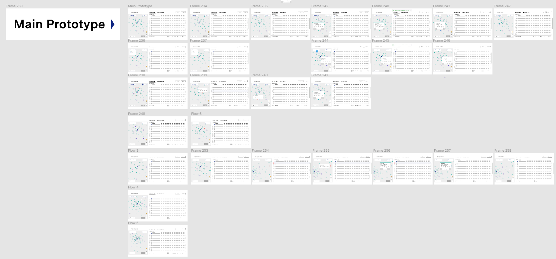
vertical + horizontal scroll. Keeping things above the fold, etc
Understanding our Users
The primary users are selling agents and brokers. These agents use geniusprice to accurately price their client’s home. Geniusprice allows the agent to search their clients home and see the valuations, property details, transaction history, comparables (sold, listed, and pending), generate and share reports, and learn more information about the surrounding area.
Early or alternate ideation
Competitive Research: looked into other real estate websites, CMA websites, and that show comparables.
Low-fidelity: Spent a lot of time working in lo-fi greyscale wireframing and prototyping to figure out the best layout to house that much information. There were multiple rounds of feedback with the Product Owner and Design Director.
Functionality: Researched several websites that show a map along with a table to understand functionality between the two (ex, hover states, map interactions, table layouts, etc).
Mid-fidelity:Produced mid-fidelity designs and worked on a prototype which we tested amongst 12 usertesters from usertesting.com. We had a pretty decent success rate.
Final solution
Design:
Tabs for each type of comparable (Sold, Listed, and Pending)
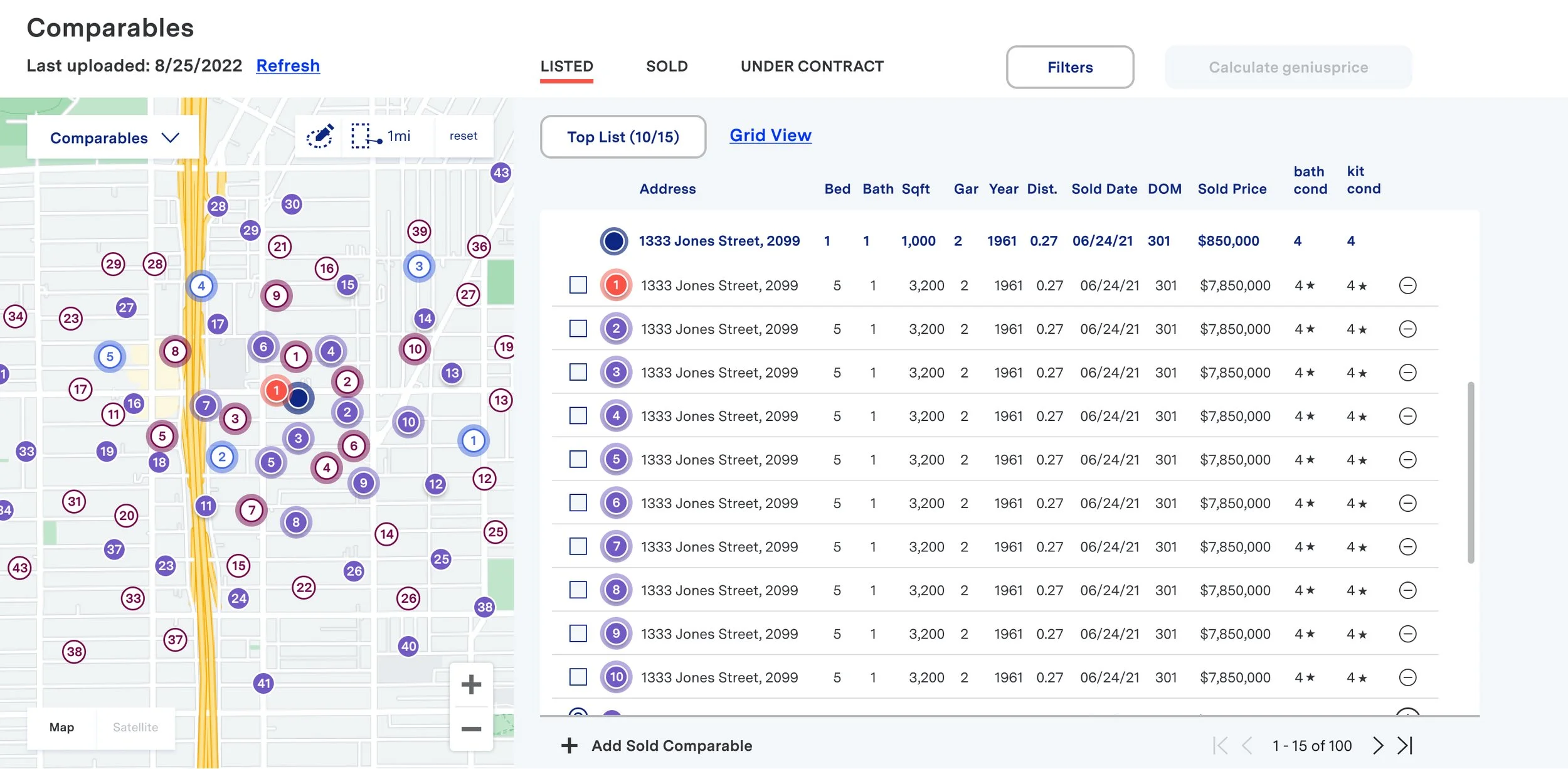
Established a “Top List” feature in order to keep things organized
The top list consists of the top 10 comparables for the subject property
Comparables can be added or removed from the list (max of 15).
User can use top list to calculate mygeniusprice
Top list will be featured in the report
Filters stayed the same
Map can be collapsed so the user can see the full table with all of the columns
Small menu appears when user clicks on the row. From the menu they can add/remove a comp, view the photo history for that property, and view the property on the map. The menu lives at the end of the row, but since it will get cut off on most devices its a learned behavior for users
Functionality:
Hover over map pins to display a property card and comparable highlights in the table.
Select a map pin to keep property card showing and highlights comparable on the list.
Select comparable on the list and the map will adjust to display the selected comparable and the subject property.
New Comparables Section. Live on prod.
New Comparables Section. Figma Mockup.
Removing comps from the list. Figma Mockup.
Replace comparable modal. Opens when user attempts to add comparable to their list when they’ve already reached their max. Figma Mockup.
Collapsed map on desktop. Figma Mockup.
Comparables List on Mobile. Live on Prod.
Comparables Map on Mobile. Figma Mockup.
My role
As the lead designer for geniusprice I saw this project from initial lo-fi designs to final development.
I worked closely with the geniusprice product owner to understand project requirements.
Conducted competitor and design research
Designed low-fidelity designs and did internal critiques with the product owner, UX Director, and other designers who work at homegenius.
Put together a prototype that was used to test the concept with a group of user testers from usertesting.com. After going through the results I put together a presentation and shared it with stakeholders.
Set up design files to hand off to dev. I laid out the designs across multiple viewports along with a document showing all of the states for the new pricing component.
After designs were handed off, I attended refinement meetings each week where we reviewed the designs with the dev teams and BA’s. In these meetings I was able to answer any questions regarding the designs and functionality.
As designs were getting developed I was available to support the QA team in their review process.
Next steps and learnings
Some learnings were the filters and the top list. A lot of people were confused by the way the filters functioned. We spent some time UT the filters specifically but never got to solutioning. A couple of ideas were to separate the top list from the rest of the comps. Another solution was instead of loading the top list with 10 comps right away we have the agents add comparables the comps they feel should be in their top list. That way the idea of the top list is super obvious since they are the ones that added them.
It was very important to me that the table and map fit within a desktop screen. I had designed the table height shorter on smaller desktop screens and taller on larger desktop screens. So if you viewed the table on a 1920x1080 screen you’d be able to see more rows than you would on a smaller desktop screen. Unfortunately it was never implemented, if there was more time I would have tried to get that fixed in prod.
Looking back I would have also met with lead developers earlier on in the process to get more feedback on certain types of functionalities and possibilities.
There were several screens and component states that needed to be shared with dev and at the time of this project we didn’t have the best Figma hand off set up. Since then we found better ways to set up our files. So future projects had a different layout to keep everything organized.
Team Members
Product Owner - Dalisa
Lead UX/UI Designer - Sarah Walsh
Tools Used
Figma


